This is a collection of resources for inspiration, design patterns and data sets you can use to stay informed or as you work on your own data project around COVID-19.
Dashboards & Maps
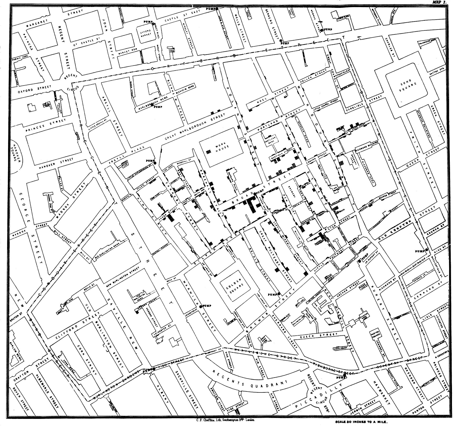
While dashboards have their disadvantages (my ex-colleague Lucy can convince you, this is her blog post) they are very appreciated by a lot of people and particularly people in public health. The use of maps goes back to John Snow’s (the other John Snow) mapping of cholera in London, and is frequent, as you can see from the images of the projects below.
International Dashboards

The World Health Organization (WHO) has released a dashboard to follow the progress of COVID19 infections.

The John Hopkins University (JHU) has also released a similar tool. You can access it in this link. It looks like data is updated more frequently than in the WHO dashboard.

The Washington Post published an article about self-isolation that has inspired this great open-sourced COVID spread simulation.

Harvard has created a very interesting interactive dashboard where you can see an animation of the spread of the disease.

NTV has a dashboard with information for European countries only, in German.

The European Centers for Disease Prevention and Control also have a global data dashboard with different epi curves.

Statnews has developed a dashboard with a minimalistic design.

The University of Virginia has also created a dashboard with a time slider to see figures across time.
National Dashboards

The British Public Health organisation has created an online dashboard with national data.

This is the Ireland Government dashboard made with arcgis.

India also has a national dashboard that reports national and regional figures.

India has this other dashboard, and this one was surprising to me: It allows the tracking of users in quarantine with names and addresses. It has other interesting features such as hospital preparedness or foreign travellers locations, also including personal data.

CNBC has created a dashboard created with tableay that displays counties where two or more cases have been confirmed in the USA..
Local Dashboards

The Dupage County Health Department in USA published a dashboard with local data inspired in the JHU design.

The Massachusetts Department of Public Health publishes a document on a daily basis including granular case reports and test results from labs.

Also in Massachusetts, by the Department of Public Health there is a dashboard made with arcgis with cases progress and locations.

The City of Boston has a very simple but easy to understand dashboard made with tableau with key indicators about the disease in the city.

The Santa Clara County in the USA also has a dashboard with local data. It is made with Microsoft BI.

The King County in the USA creates a daily report with maps and charts using Tableau.

The California Life Sciences Association in the USA has created this interesting dashboard that shows the key hashtags and influencers in social media around the coronavirus topic in the state.

The South Australian Government has a website with different graphs and indicators that is updated on a daily basis.
Chatbots
I have advocated for chatbots in healthcare since I started my project bots4health in 2016. 4 years and a pandemic later global health institutions and national ministries of health have all started working on their own conversational interfaces to bring public health information to citizens and to alleviate the workload of emergency lines. This is a list of chatbot projects active in the COVID19 response.

The World Health Organization has a WhatsApp chatbot that can provide advice and information about COVID19. It had conversations with over 100 million people during the first 3 days. It is available in English, Arabic, French, Spanish and over 20 other languages. There are different phone numbers for each language.


The UCSF Health and Northwell Health are using a chatbot created by Conversahealth that can help with screening and triage, quarantine checks or lab results followup.

The CDC chatbot is made based on the Microsoft Healthcare bot framework and can help with self-assessments, tele-health and consult scheduling.

Covidbot is a mexican chatbot that fights misinformation about the disease by answering questions about myths and hoaxes.

Carinabot, created by the Spanish 1millionbots, answers questions about coronavirus from various Spanish and Latinamerican websites of public institutions or univerisities.

Eva, at bots4health, answers questions about coronavirus and other health topics in English or Spanish.
Data sources
If you too want to start your own project, these are some dashboards and data sources about coronavirus that can help you in your task:
- Global Health Observatory OData API by WHO, limited access.
- GitHub Repository by JHU, open data for research and academics.
- Tableau has created a COVID-19 Data Hub that includes a template to get started with your own analysis.

I have participated in projects related to epidemiology and data in the past and I have started projects like bots4health to facilitate the use of data in healthcare and public health. What I have lived has made me a big believer in the power of data.


